A bar chart is great for sharing a statistic that has multiple categories and for comparing the same variable for different geographies.
Add the bar chart visualization
Step 1: Select the bar chart icon
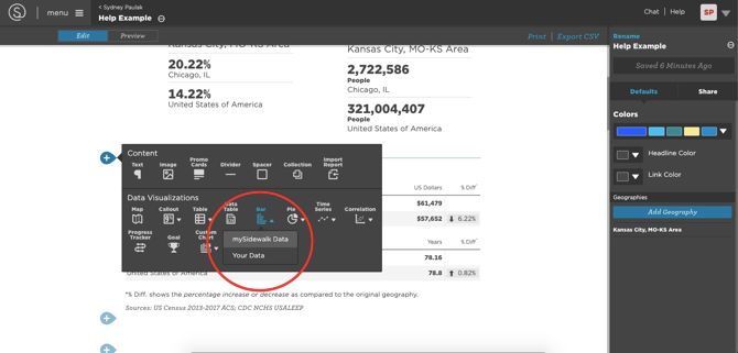
- To add a Bar Chart, click the Bar Chart icon on your report or dashboard page. Choose between mySidewalk Data or Your Data as the data source.
Step 2: Choose a dataset

- If using mySidewalk Data, browse and select a dataset.

- If using Your Data, pick a dataset from your uploads.
Step 3: Set the chart orientation

- In the Chart orientation drop-down, select either:
- Geographies (default): focuses on geographical comparisons
- Variables: focuses on variable comparisons within a single geography
Create a geography-oriented chart
After setting the Chart orientation to Geographies:
Step 1: Select geographies
- Go to the Geographies tab.
- The visualization has inherited the first geography from the report or dashboard page's global settings. You can use it as is, change it, or add to it.

- If you're using mySidewalk data:
- Click the pencil icon next to the geography's name to change it.
- Click Add Geography.
- Use the search option to find additional geographies.
- Click Finish Selecting.
- If you're using uploaded data:
- Click the pencil icon next to the geography's name to change it.
- Click Manage Geographies to add geographies.
- Select from the geographies contained in the layer.
- Click Finish Editing
Step 2: Modify geography selections

-
Next to each geography, use:
-
The pencil icon to change the geography.
-
The trash can icon to remove the geography.
-
The double-bar icon to rearrange order, impacting the legend display.
-
Step 3: Normalize data

- Under the Data tab, select a Normalization option: Global or Individual to allow a standardized comparison. Global normalization applies a single denominator to each variable, while individual allows you to normalize each variable separately.
- The image highlights Global normalization. Go to the Normalization section for a more detailed look at both types of normalization.
- Adjust the Format to display as Ratio as Percent.
Your chart is done!
Congrats on building a geography-oriented bar chart.
Create a variable-oriented chart

Setting the Chart orientation to Variables places the variables in the legend and moves the geographies to the x or y-axis (depending on the Chart Layout - horizontal (default) or vertical - which is set in the Style tab).
Create a variable-oriented chart with multidimensional data ("legend grouping")
If you've selected a multidimensional dataset (i.e. multiple crosstabs), in addition to a variable orientation, you also have the option to create a grouped bar chart.
Note: This option is available for mySidewalk data only.
Step 1: Select the "None" option for multidimensional data.
- Multidimensional data will have a Dimension drop-down next to the Time element.
- You can select a specific dimension from within the parent dataset, such as Public vs Private Private Insurance in the example below. Or, you can select None to visualize the full dataset.

Step 2: Set the chart orientation to "Variables."

- Initially, all of the variables will display as individual bars on the chart. Each variable includes all dimensions from the chart — insurance type and age in our example.

-
Change the Chart Orientation to Variables to place the variables in the legend and move the geography to the x or y-axis (depending on the Chart Layout - horizontal (default) or vertical - which is set in the Style tab).
Step 3: Select a "Legend grouping" option.

- Each dimension of the dataset (in our example, Private vs Public Insurance and Age) is available as a Legend grouping. Select the dimension you want to represent in the legend; the other dimension(s) will be represented on the chart axis.
Note: There are three limitations when using grouped bar charts.
- Variable labels can't be edited,
- Variables can't be sorted or reordered, and
- Variables can't be hidden.
Normalize data in a bar chart

-
Choose a Normalization Type: Global or Individual
-
Global normalization will apply a single normalizer to every variable.
-
Individual normalization allows different normalizers for each variable.
-

Global normalization
- For Global normalization, select the normalizer from the Normalize by drop-down that appears under the Normalization Type drop-down after Global is selected.

Individual normalization

- For Individual normalization, in the Variables list, click the pencil icon next to each variable to expand the card and select the normalizer from Normalize by.

- Set the Format to Ratio as Percent.
Normalizing when using your data
The steps to normalize data while using Your Data are largely the same as the steps when using mySidewalk data (outlined above) with one main difference. Select a normalizer either:
- from your data (i.e. the currently selected layer) or
- from a set of default denominators from mySidewalk data.
- These include: Total Households, Total Housing Units, Total Population, Area in acres, and Area in square miles.
Reorder, relabel, and hide variables
In the Variables section of the Data tab, you can:
-
Click and drag the double-bar icon to reorder a specific variable
-
Use the Sort By button to select a sorting rule (like High to Low or A to Z)
-
Click the pencil icon to expand a variable card and edit the label
-
Click the eye icon to hide a variable from a chart
Note: When using Legend grouping, the ability to edit labels, sort or re-order variables, or hide variables is disabled.
Style a Bar Chart
In the Style tab, you can:
-
Change bar colors
-
Change the chart layout (horizontal or vertical)
-
Add a static line to show an average or goal value
-
Edit the title, add footnote, and an accessibility description
And make other stylistic choices