Create a Time Series
Make a line graph charted over time.
Use a time series to show how a variable or set of variables changes over time, so you can identify patterns, trends, or shifts that inform decisions.
Step 1: Select the time series icon
-
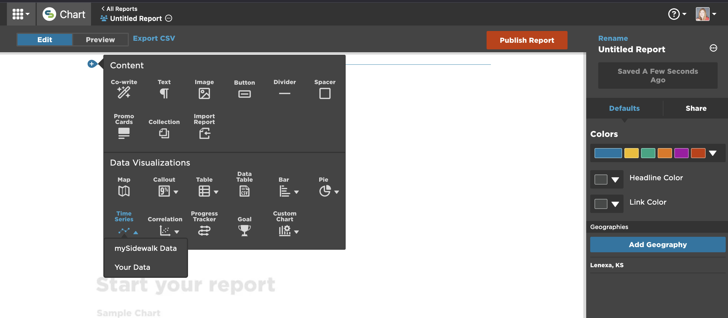
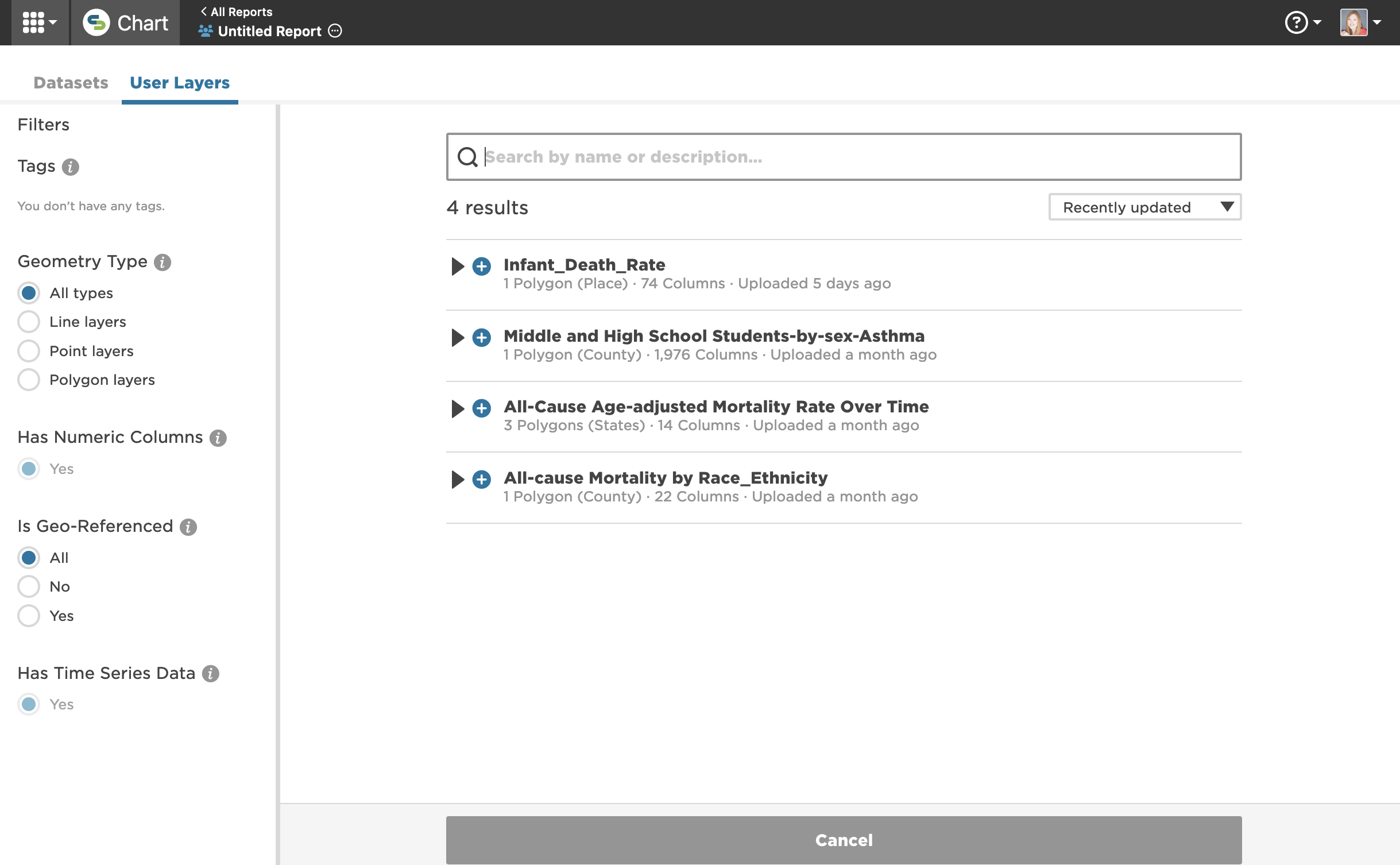
To add a Time Series chart, click the Time Series icon on your report or dashboard page. Choose between mySidewalk Data or Your Data as the data source.
Step 2: Choose a variable
-
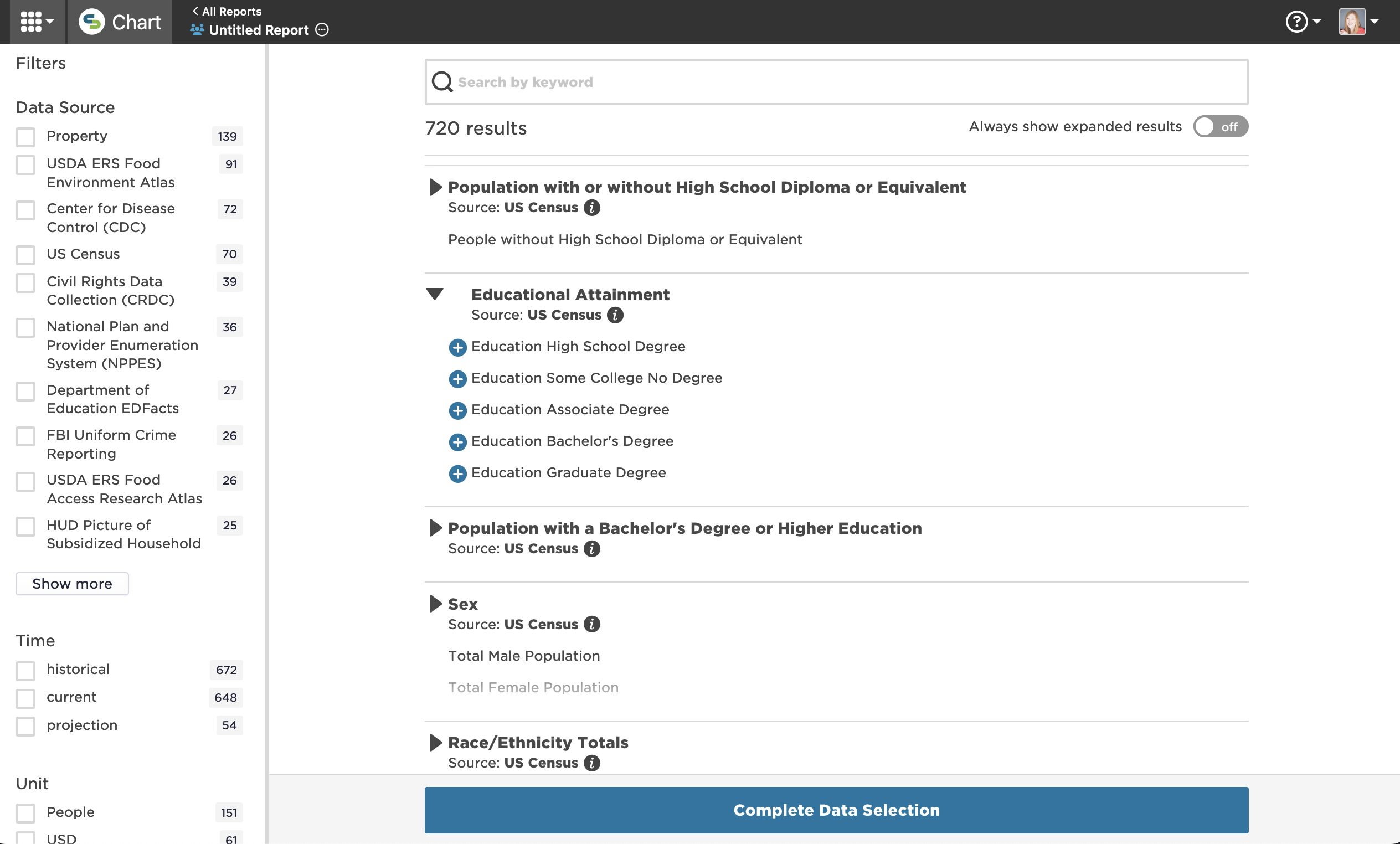
If using mySidewalk Data, browse and select a variable.
-
If using Your Data, pick a variable from your uploaded dataset.
Step 3: Set the chart orientation
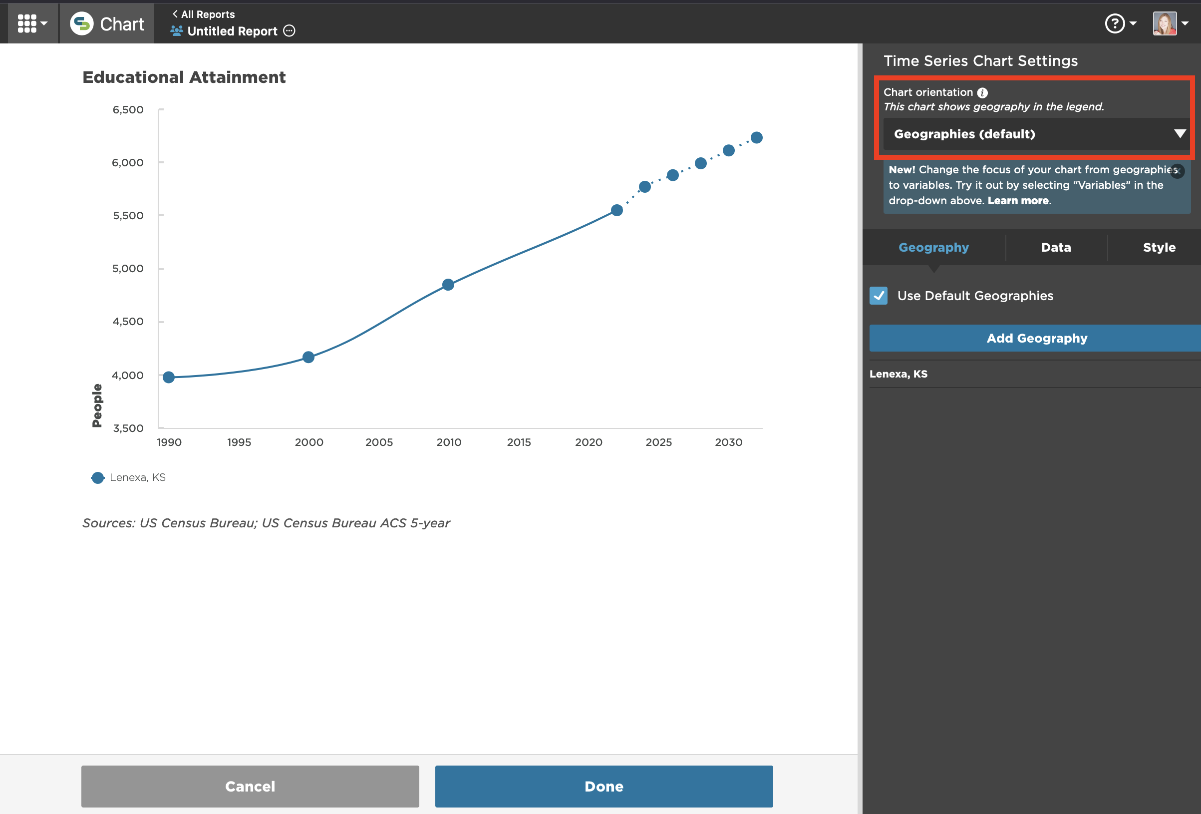
- In the Chart orientation drop-down, select either:
- Geographies (default): focuses on geographical comparisons
- Variables: focuses on variable comparisons within a single geography
Create a geography-oriented chart
After setting the Chart orientation to Geographies:
Step 1: Select geographies
- Go to the Geographies tab.
- The visualization has inherited the first geography from the report or dashboard page's global settings. You can use it as is, change it, or add to it.
- If you're using mySidewalk data:
- Click the pencil icon next to the geography's name to change it.
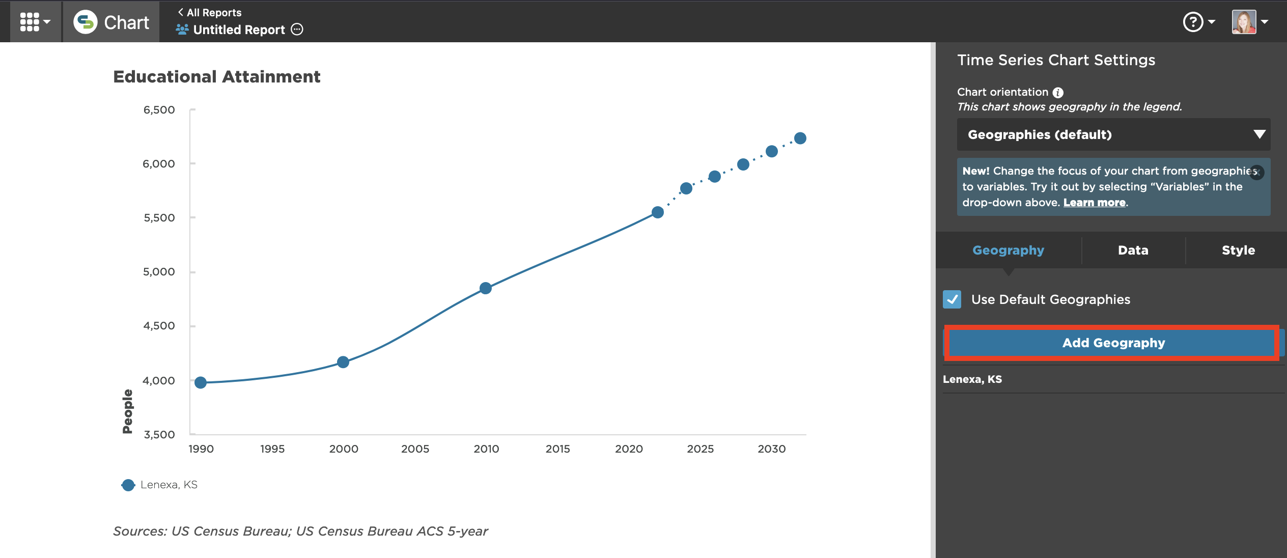
- Click Add Geography.
- Use the search option to find additional geographies.
- Click Finish Selecting.
- If you're using uploaded data:
- Click the pencil icon next to the geography's name to change it.
- Click Manage Geographies to add geographies.
- Select from the geographies contained in the layer.
- Click Finish Editing.
Step 2: Modify geography selections
-
Next to each geography, you can use:
-
The pencil icon to change the geography.
-
The trash can icon to remove.
-
The double-bar icon to rearrange order, impacting the legend display.
-

Step 3: Normalize data (optional)
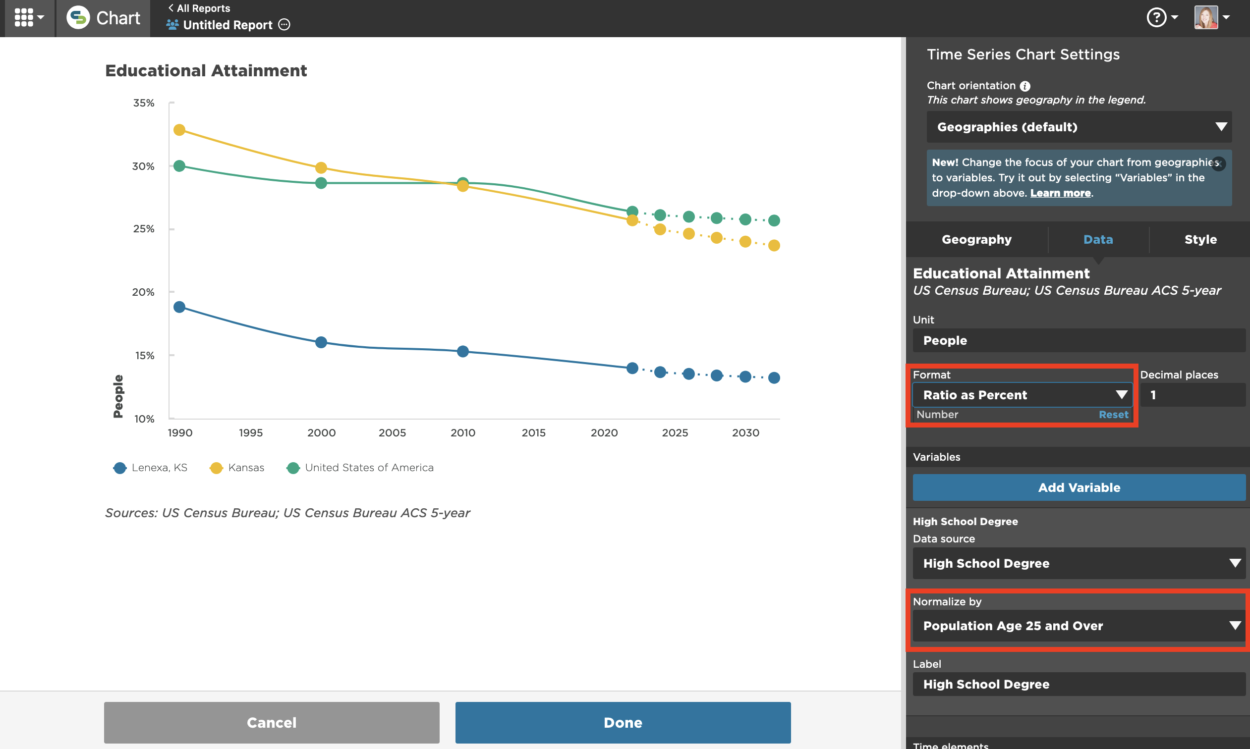
- Under the Data tab, select a normalizer to allow a standardized comparison.
- Adjust the Format to display as Ratio as Percent.
Create a variable-oriented chart
After setting the Chart orientation to Variables:
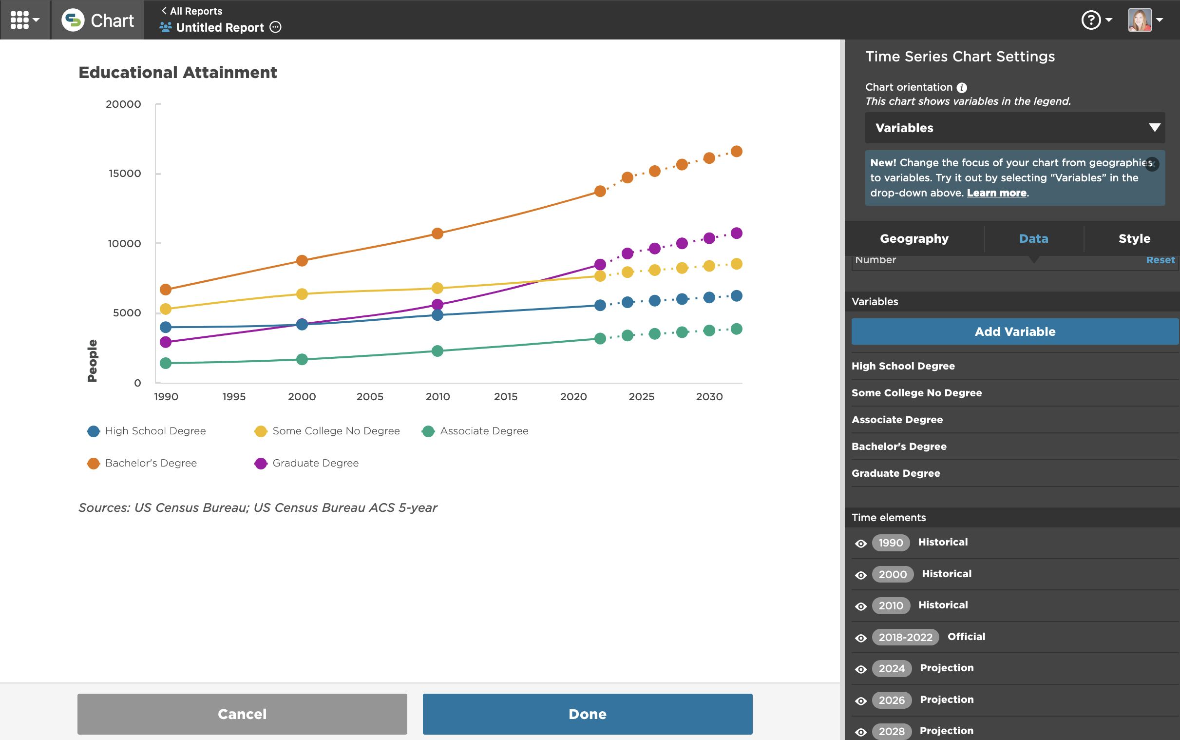
Step 1: Add or modify variables
- Under the Data tab:
- The first variable is already selected. Open the drop-down menu in the variable card to see all available variables within the selected dataset.
- Click Add Variable to include another. A new variable card will appear below the last variable. Continue adding variables until your chart is complete.
- Collapse and reorder variables using the x and slider icons on the right of each variable. As you move variables, the chart will update.
Step 2: Normalize data (optional)
-
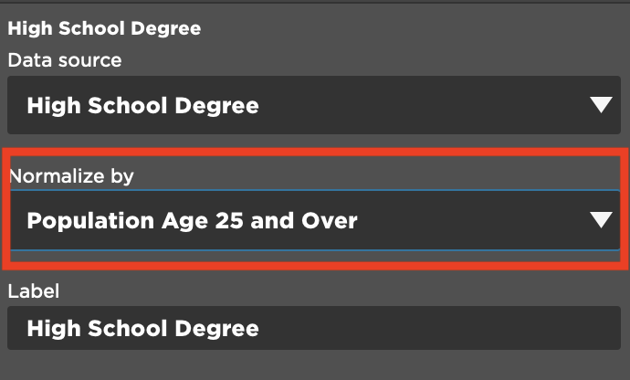
For each variable, select a normalizer from the Normalization drop-down.
-
Change the Format near the top of the Data tab to Ratio as Percent.
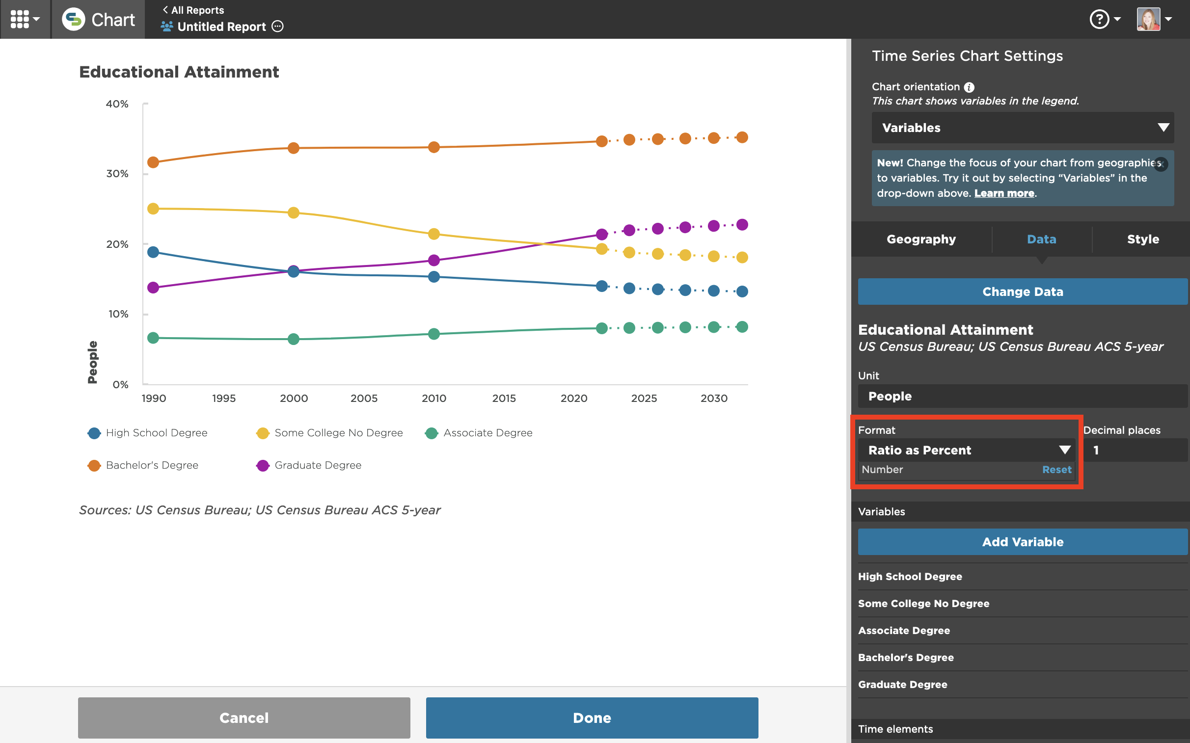
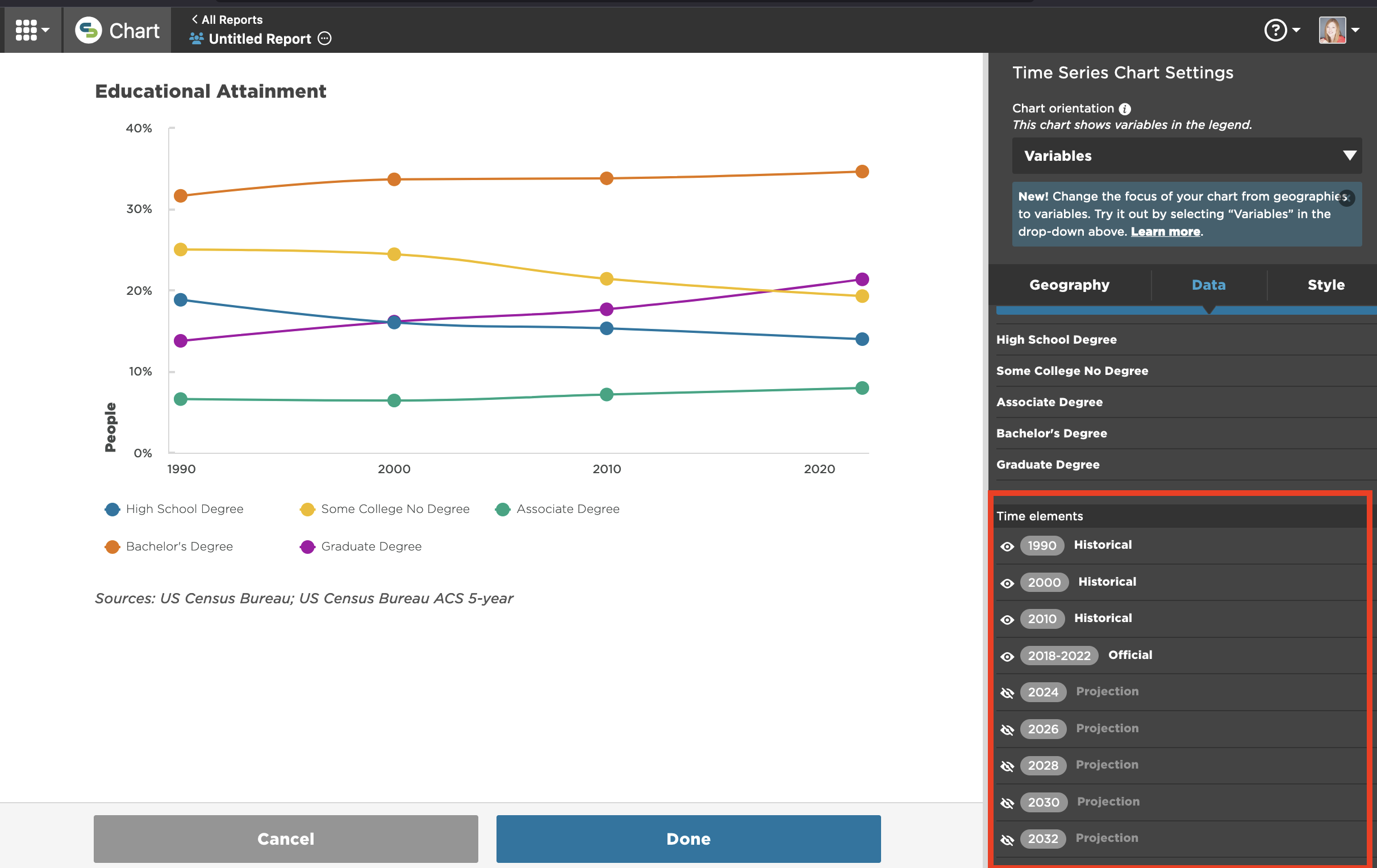
Step 3: Adjust time range (optional)
-
Use the eye icon in the Data tab to hide or display specific time elements.
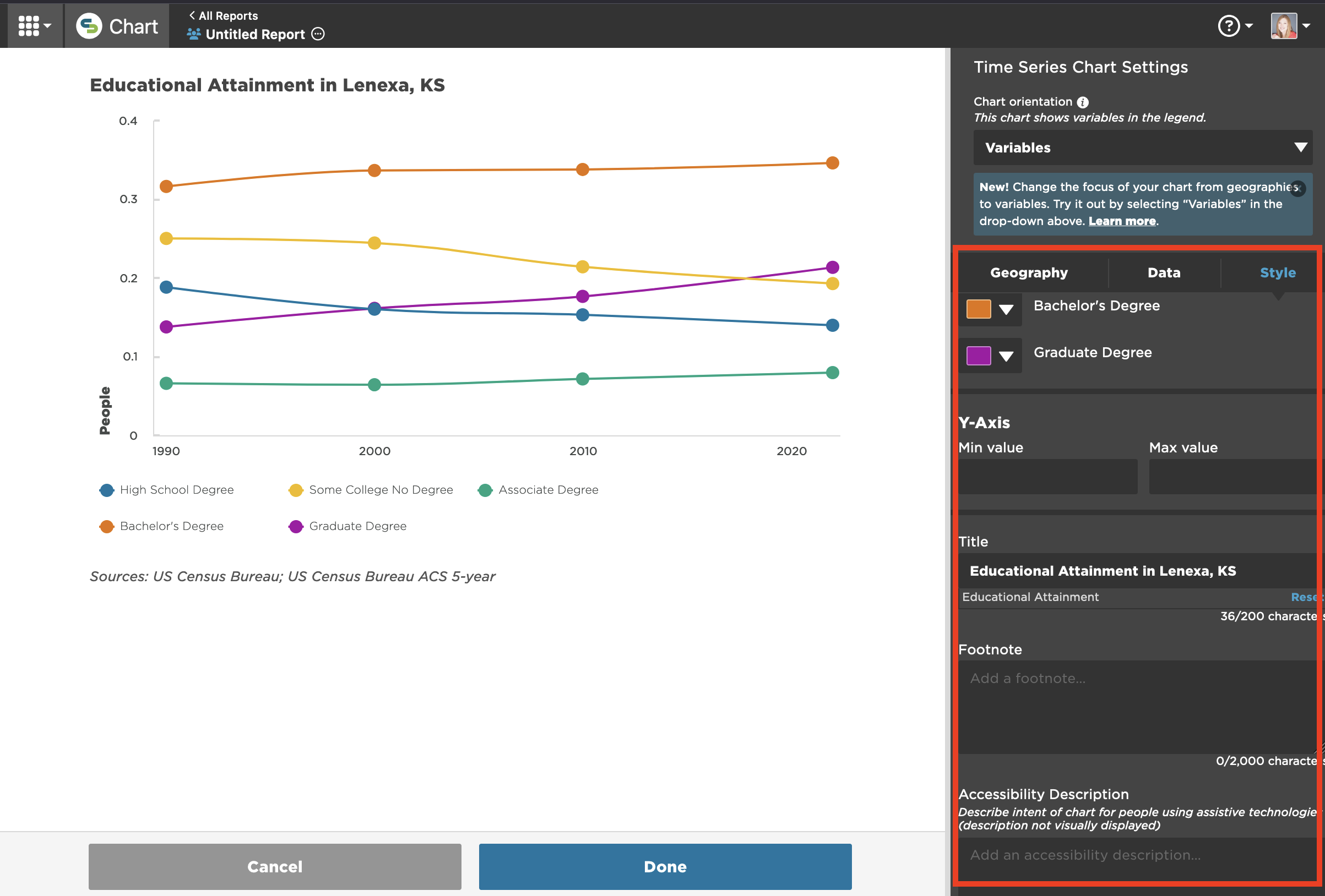
Step 4: Style the chart (optional)
-
Go to the Style tab to change colors, set minimum and maximum values on the y-axis, and add a title, footnote, and accessibility description.
FAQs
Why are some variables within a dataset not available for a time series?
-
Variables must have at least two time periods to be visualized as a Time Series. For example, the full Educational Attainment dataset includes 7 variables but 2 - Less than 9th Grade and 9th to 12th Grade, No Diploma - were not included in the 1990, 2000, or 2010 Census counts and therefore the only available data point in mySidewalk is the most recent ACS 5-year estimate.
How does normalization work in a Time Series?
-
For each data point, the numerator and denominator are from the same year.
Why do I need to make the same denominator selection repeatedly?
-
In many cases, using a consistent denominator across variables makes sense (e.g. household size/total households), but there are situations where it's more appropriate to normalize each variable by its own relevant universe. If you’re looking at cost-burdened renters by race, for example, you might choose to normalize each race by the total number of renters within that race instead of the overall renter population. To allow for this, we’ve elected to provide normalization at the variable level instead of the global chart level.
