Seek Table View
Use the Table tab in Seek to find insights.
Getting started in table view
Seek is set up as a workspace with a Display Panel on the left and a Control Panel on the right.
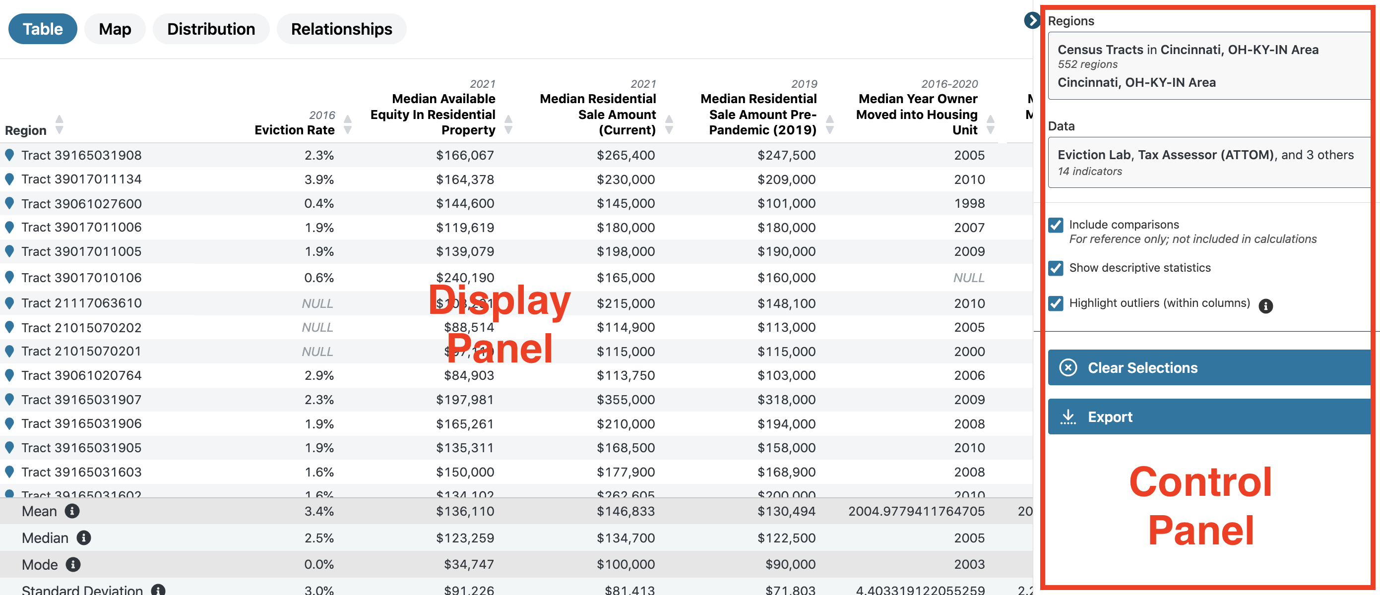
Your selected regions and data via the Control Panel determines how data shows up in the Display Panel.
To use the Table view, you must first select regions and data.*
Note: if you’ve already selected regions and data in another view, your selections will carry over. You can always change or add to your selections by returning to the Regions and Data modals in the Control Panel.
What you can learn from the table view
The Table view is one of four different views, or ways of looking at your data and region selections. The others are
- Map,
- Trends,
- Distribution, and
- Relationships.
Use the table view when: you want a detailed look at the data in your selections. The table view presents data in as close to a raw form as possible.
Scroll vertically and horizontally to quickly scan indicators across geographies and get a sense of the overall size and scope of specific datasets.
Using the table view
Several features in the Table view will help you make sense of the information.
Include comparisons
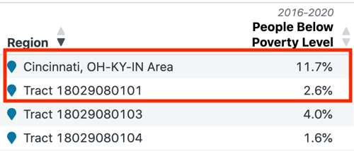
- In Seek, a comparison is when you compare larger areas (ZIP codes, places, counties) to each other and/or to smaller areas (census tracts, block groups) within the larger area.
- In the Table view, you might query data for a larger region, such as a county or a place, and then drill down into smaller regions, such as census tracts or block groups.
- You can include comparison regions as separate rows in your table by checking the box Include comparisons in the Control Panel.
- This will allow you to visually compare values.
- However, comparisons are not included in the calculations that produce descriptive statistics for your query, such as mean, median, and mode.
Show descriptive statistics
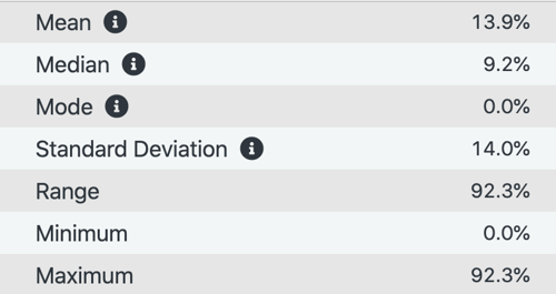
- Descriptive statistics like mean, median, mode, and standard deviation summarize the characteristics of the data you’ve selected.
- You can turn them on by checking the box Show descriptive statistics in the Control Panel.
- Learn more about these statistical concepts and how you can use them in spatial analysis in our article, insights from statistics in Seek.
Highlight outliers
- One of the most useful features for quickly spotting insights or patterns in the data is the ability to highlight outliers in the table.
- In the Control Panel, check the box Highlight outliers to show regions where values are significantly higher or lower (more than three standard deviations) than the median value in the data set or sample.
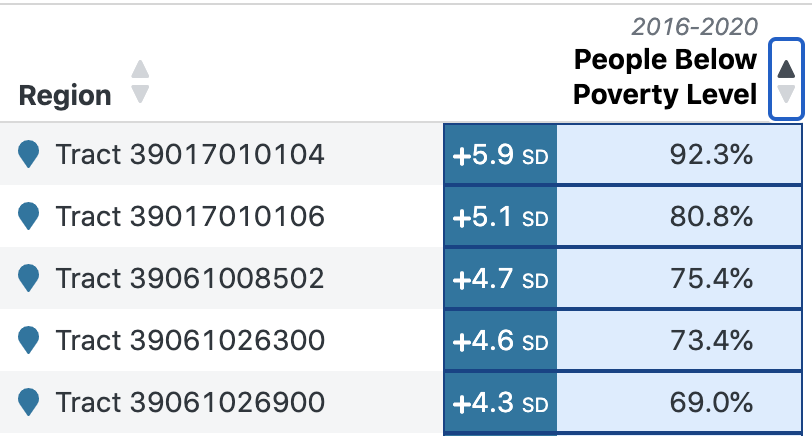
Sort by column
- Sort the table from high to low or vice versa based on specific indicators by clicking the up or down arrow to the right of the indicator’s name.
- This can be especially helpful when you want to see all of the outliers in a particular data set or sample grouped together (as shown above).

Open indicator details
Get detailed information about an indicator by clicking on the indicator name in the top row of the table.
Details include:
-
Original source
-
Collection date
-
Publish date
-
Source table and universe
-
Data definitions
-
mySidewalk calculations (if applicable)
-
Geographic availability in Seek
Open region details
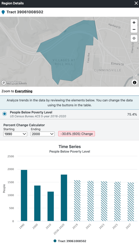
- Get detailed information about a region by clicking on that region’s name in the Region column (far left).
- This allows you to:
- View the region on a map (which is helpful in case you haven’t memorized every census tract!)
- Analyze trends for that region on specific indicators with a percent change calculator and time series chart.
