Read a Map Legend
Learn how to read a map that has one variable or two.
Reading maps that display data can sometimes be overwhelming, especially for new users. This article breaks down how to read both single indicator and bivariate maps by focusing on the legend. Mastering the legend allows you to discover patterns in the data that may otherwise go unnoticed.
Single indicator map
 In Seek’s maps, data is represented through a color ramp, which shows variations across selected geographies. The legend is your guide to understanding what each color represents.
How to read a single indicator map legend
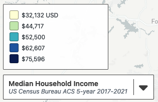
Each color on the legend corresponds to a range of values. The lowest value appears at the top of the legend, progressing to the highest value in each group.
- The first group in the legend above represents the lowest value range (e.g., $32,132 – $44,716).
- The last group shows the highest value range, but the exact maximum is not shown in the legend (it can be found in the table view of the data).
Tip: The legend splits data into buckets based on a break methodology. Familiarize yourself with the options for break methodology here. mySidewalk uses natural breaks by default.
Bivariate map
A bivariate map shows two indicators simultaneously. The legend for a bivariate map uses a color scale to represent the intersection of these two variables, making it possible to visualize complex relationships.
How to read a bivariate map legend
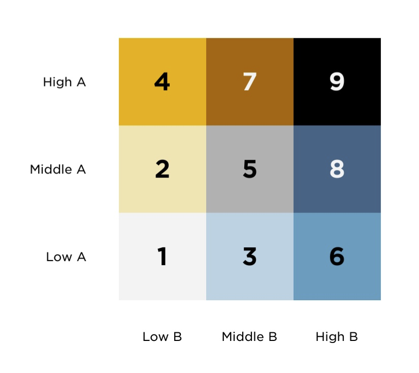
The legend uses a diverging color scale, such as yellow-blue or magenta-green. Each indicator is broken into three groups: low, middle, and high. The intersection of these groups forms a 9-color grid, with each color representing a different combination of the two indicators.
The diagram below lists each of the nine colors in a yellow-blue bivariate legend and how each color relates to the data values for variables A & B.

Example
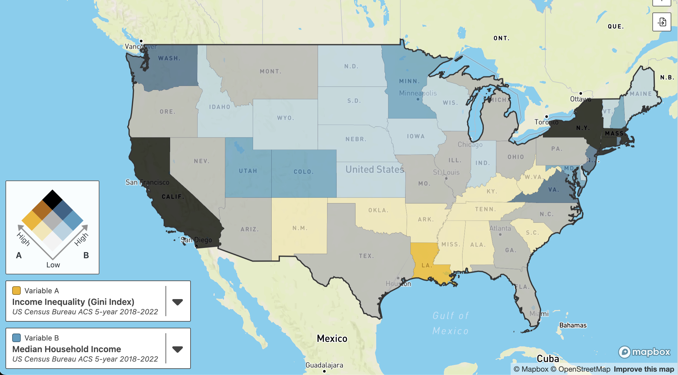
The legend’s axes represent the two indicators:
-
Variable A: Income Inequality
-
Variable B: Median Household Income
Example map:

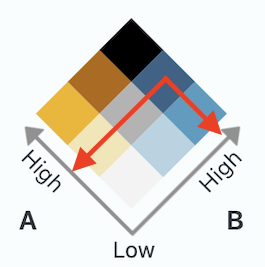
To identify what a color in the bivariate legend represents, think of arrows pointing to where it's positioned along each axis. For example, using the image below as a guide, the dark blue is:
- High on the B axis for Variable B, median household income
- Medium on the axis for Variable A, income inequality

Likewise:
-
The middle gray square shows where median household income and income inequality are both medium.
-
And the light orange is low on the B axis and high on the A axis.
-
So median household income is low and income inequality is high.
-