Create a Callout
Learn how to make a callout, a good way to highlight a single data value.
The callout data visualization is a great way to highlight an individual or small number of statistics, and is a good tool for comparing geographies.
Watch the video or scroll further down for written step-by-step instructions.
To add one to your report, click the Callout icon and choose mySidewalk Data, Your Data or Custom Callout.

Using the edit panel on the right, you can make changes to your callout.
For Custom Callouts, you can manually input your information here. Please note: as Custom Callouts aren't linked to a data source, they can only be manually updated.
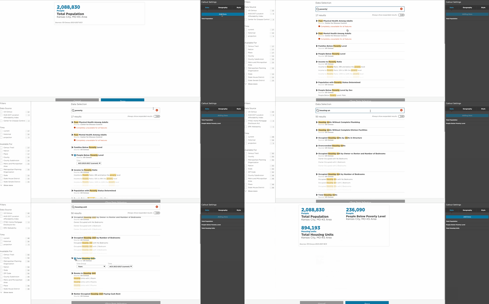
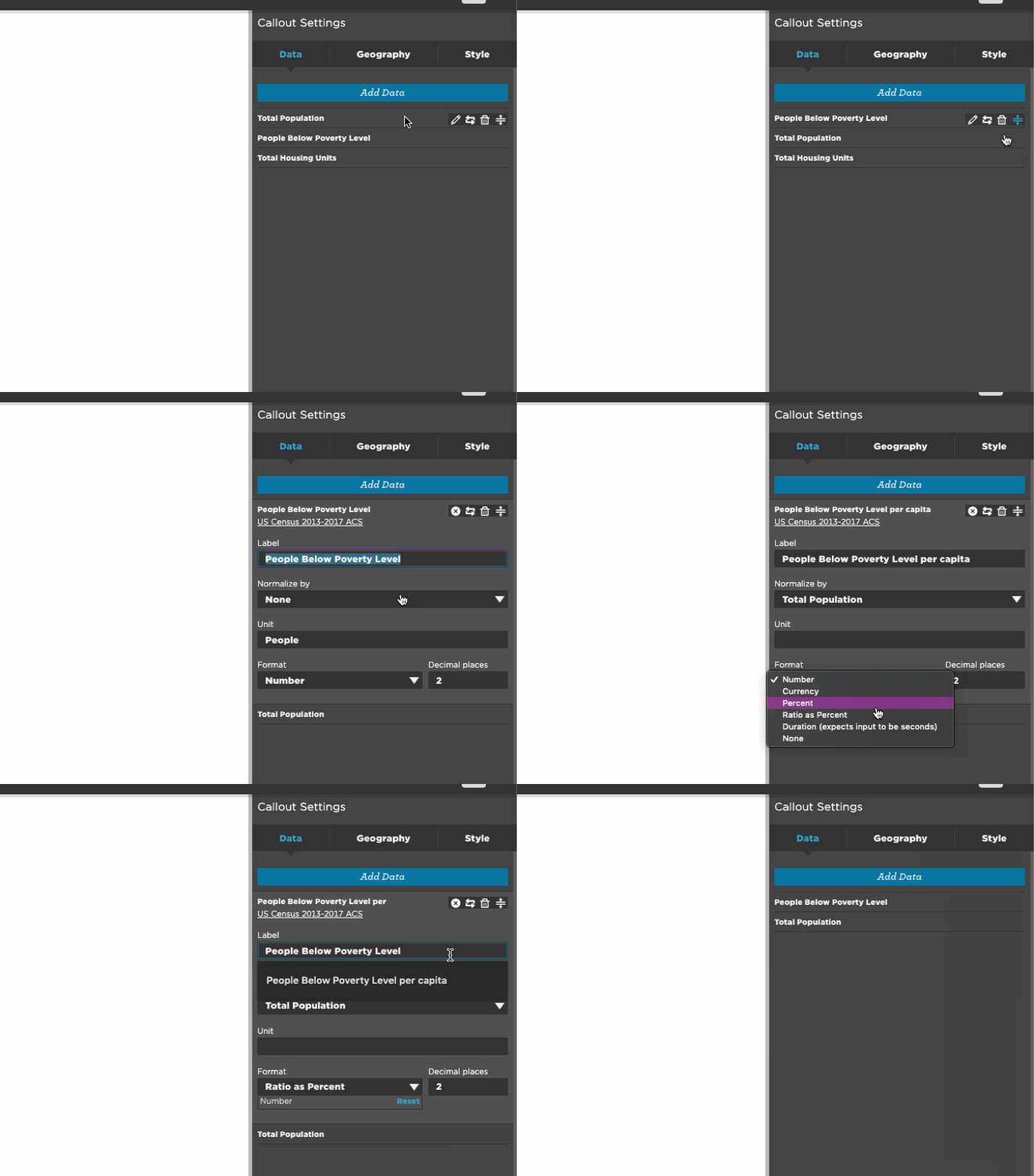
For mySidewalk Data or Your Data, you can change the statistic by going to the Data tab and then you can add other variables to compare by clicking Add Data.
Use the search option to find variables. Click the drop down arrow and add data using the blue plus button. When you open a new callout the App will automatically display the total population to fill the callout before you add data. After you add the variables you want you can click into the edit panel and delete the data listed as Total Population.

Use the pencil icon to edit, the trashcan icon to delete, and the double bar icon to rearrange the order in the edit panel.

You can also change or add geographies for comparisons under the Geography tab by clicking Add Geography. Use the search option to find other geographies and simply click them to add.
You can edit, rearrange, or delete geographies the same way as data in the edit panel.
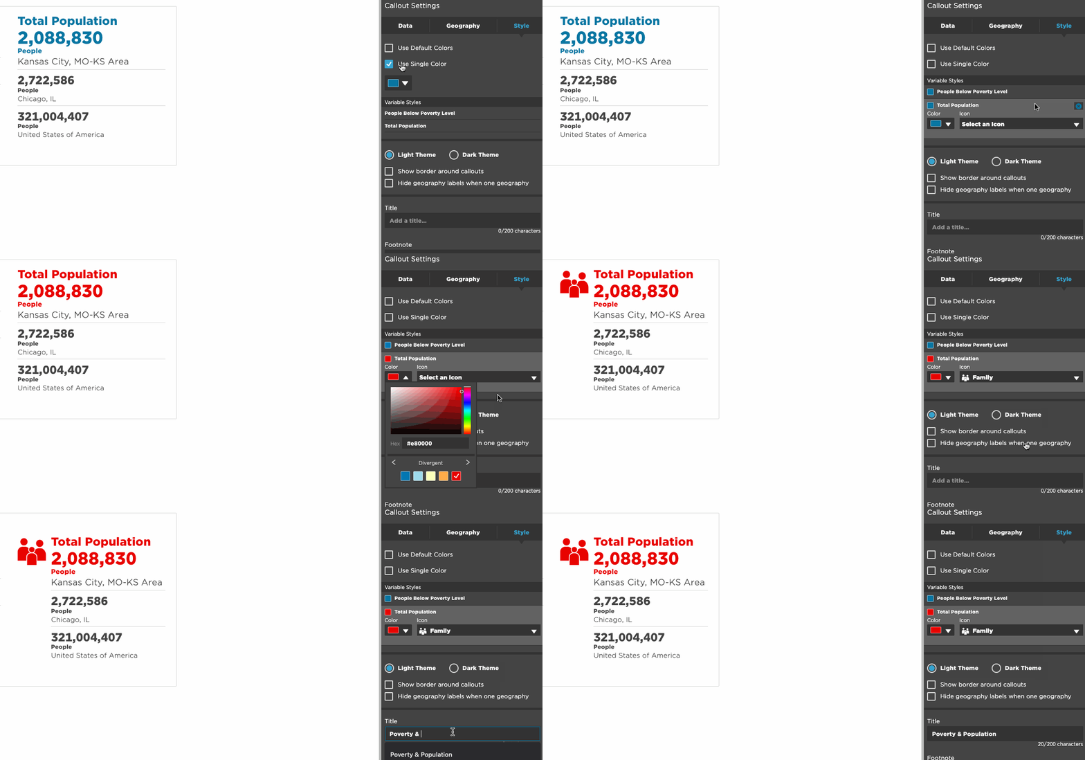
The Style tab allows you to change the color of the callout or select an appropriate icon. If your data point is talking about total population you can add the people icon to make the data more graphic. The Style tab also allows you to change the color of the callout and add a title, footnote, or accessibility description. All these elements make your callout more effective and useful.
