Create a Custom Color Palette
Build a color palette to mirror or complement your brand guidelines.
Your mySidewalk reports and dashboards should reflect the ideals and identity of your organization and community.
One easy way to make your dashboard look and feel like a a part of your organization is to create a custom color palette.
We recommend taking colors from your brand guidelines or website to help visually make the connection between your organization and reports and dashboards you build.
Watch the video below or scroll down for step by step instructions. Default color palette instructions start at about 1 minute and 12 seconds.
How to create a custom color palette
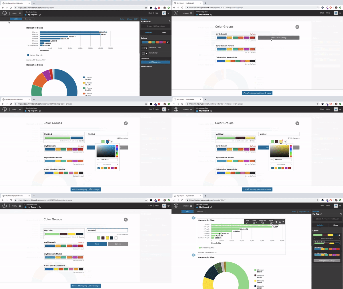
- Start by navigating to the edit panel in your dashboard or report.
- From there, click the defaults tab. This will give you several options, including a dropdown menu under the title colors.
- At the bottom of the dropdown menu there will be a button labeled manage color groups. Clicking this will open a new screen where you can edit an existing color palette or you can go to new color group to make a new one.
- From here you can select up to 6 different colors to create your organization's custom color palette.
- Click save then finish managing color groups.

Feel free to check out the Accessibility Color Palette Generator, an accessibility tool that we created to help you ensure compliance with WCAG AA guidelines. You can read more about how to use this tool here!
Change your report or dashboard's default color palette
You can now navigate back to the color dropdown option in the edit panel and select your custom color palette. This will be the default color scheme for data components in your report or dashboard, with the first color being the most dominant.
You can also change the headline and link colors by clicking the dropdown menus next to headline color and link color.
Typically we recommend that your dashboard sticks to the 6 colors in your custom color palette, but if you would like to use additional colors you are more than welcome to make changes to individual data visualization's colors as you add them to your dashboard.
Ready to learn more? Check out our dashboard style guide!