Create a Custom Chart with Manually Entered or Imported Data
Make a custom chart with data you enter directly into the visualization
The most common way to create data visualizations with your own data is by uploading it to create a layer that can be used to generate various visualizations.
However, if your data is simple, you can use the Custom Chart option in your reports and dashboards.
Starting your custom chart
- Click the Custom Chart drop down on the component menu.
- Select the chart you want to create. Your options are:
- Vertical bar chart
- Horizontal bar chart
- Line chart (such as for a time series)
- Pie chart
- Stacked bar chart
- Now, either manually input the data or import it from a CSV file. Keep reading for additional detail on how to build each visualization.
Note: The data you add to these custom charts will not appear elsewhere in the platform and cannot be reused in other visualizations. If you want to reuse a chart, you can copy and move it to another report.
Building different chart types
Bar charts
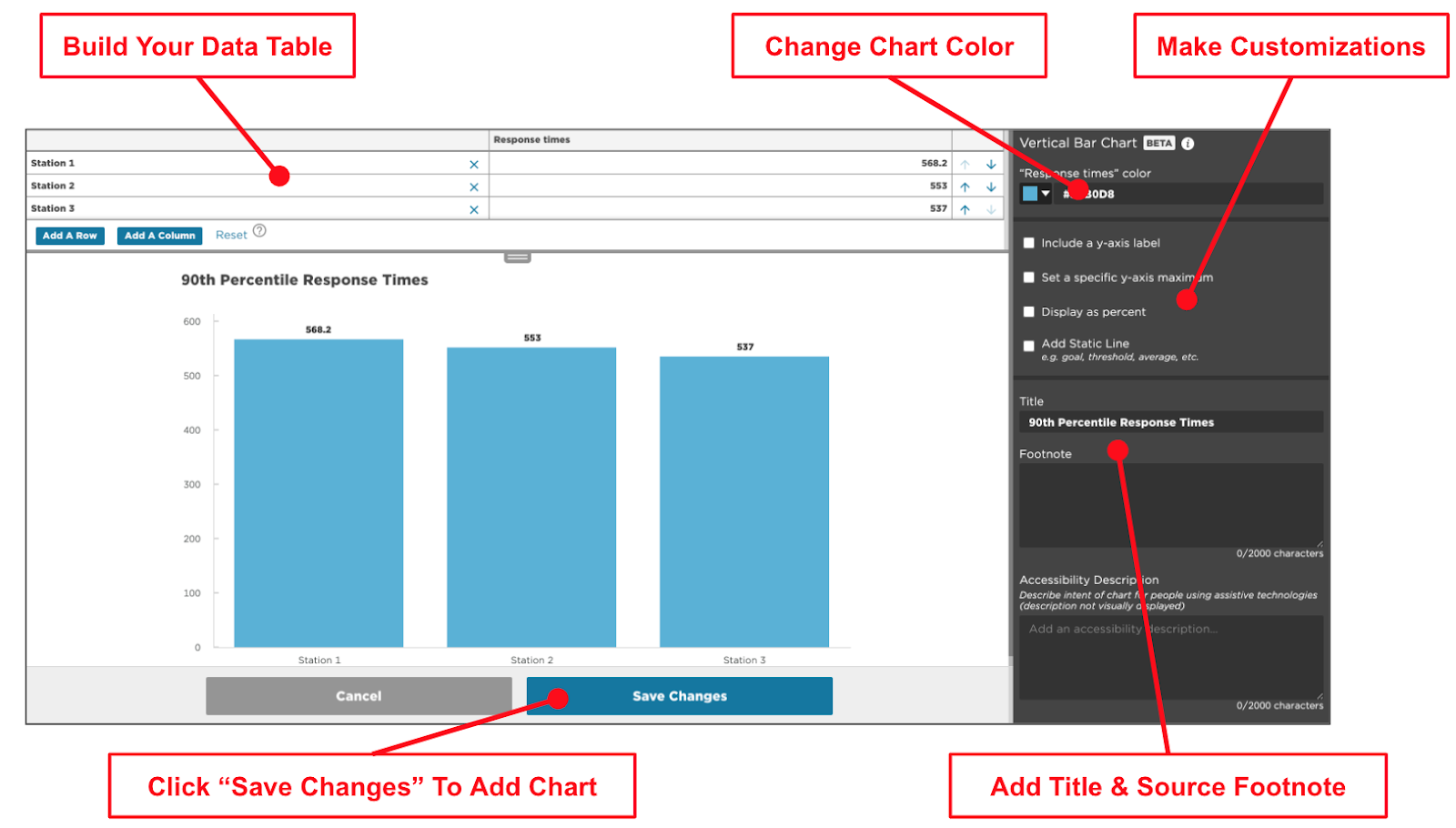
You can make vertical or horizontal bar charts.
- Build your data table: Add rows and columns to define categories and data points.
- Change chart color: Select a custom HEX color.
- If you have a branded color scheme, you will have to copy the HEX code and paste it here. You may find it helpful to paste them in a text component for easy reference.
- Make customizations (optional)
- Add a title, footnote, and accessibility description.
- Add or modify the y-axis label.
- Set a maximum y-axis value.
- Display data as numbers, percentages, or USD.
- Add a static line as a reference (average or goal).
- Customize bar sizes (small, medium, or large).
- Click Save Changes to add the chart.

Line charts
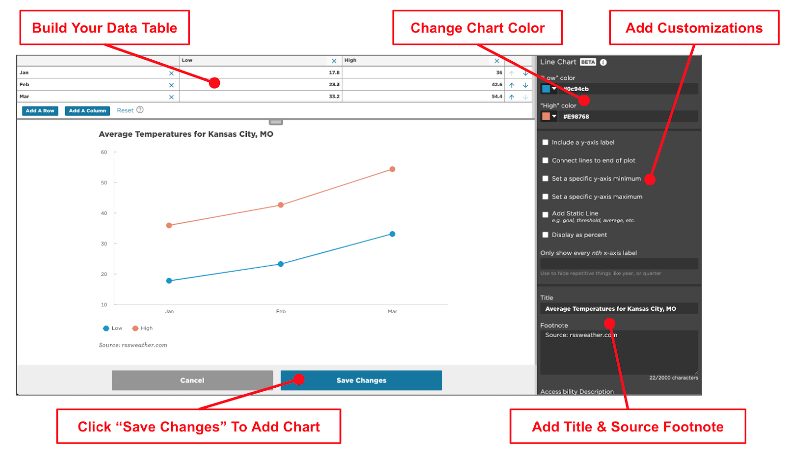
Line charts are great for visualizing data across time.
- Build your data table: Add rows (time periods) and columns (data lines).
- Change chart color: Select a custom HEX color.
- If you have a branded color scheme, you will have to copy the HEX code and paste it here. You may find it helpful to paste them in a text component for easy reference.
- Make customizations (optional):
- Add a title and footnote.
- Add an accessibility description.
- Add a y-axis label.
- Connect lines to the plot's end.
- Set a maximum y-axis value.
- Click Save Changes to add the chart.

Pie charts
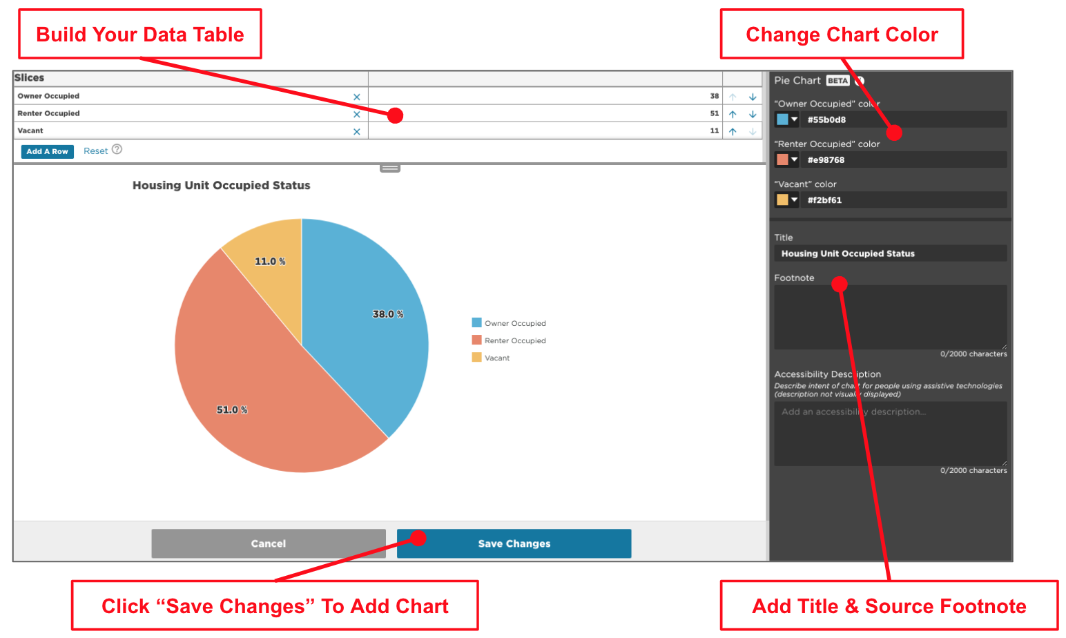
Pie charts are best for showing categorical data for a single geography. If you have more than 5-7 slices, use a bar chart instead.
- Build your data table: Add rows (categories or slices).
- Label row headers: Customize the labels shown in the chart key.
- Change chart color: Select a custom HEX color.
- If you have a branded color scheme, you will have to copy the HEX code and paste it here. You may find it helpful to paste them in a text component for easy reference.
- If you have a branded color scheme, you will have to copy the HEX code and paste it here. You may find it helpful to paste them in a text component for easy reference.
- Make customizations (optional):
- Add a title and footnote.
- Add an accessibility description.
- Click Save Changes to add the chart.
Stacked bar charts
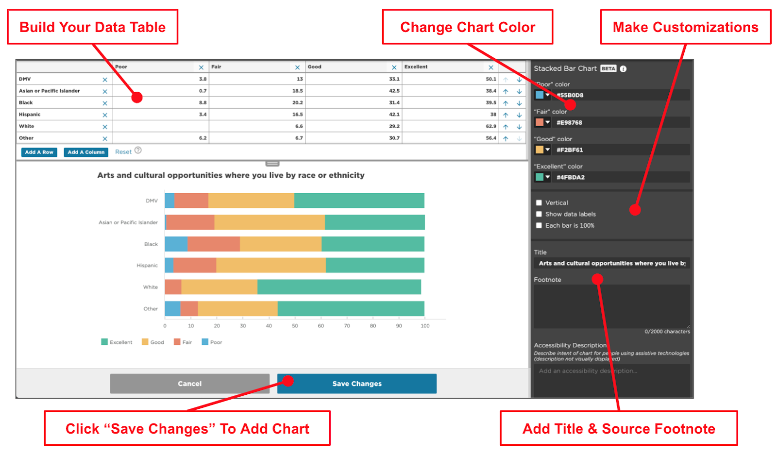
Stacked bar charts show how multiple categories add up to a larger sum.
- Build your data table: Add rows (categories) and columns (stacked data points).
- Change chart color: Select a custom HEX color.
- If you have a branded color scheme, you will have to copy the HEX code and paste it here. You may find it helpful to paste them in a text component for easy reference.
- Make customizations (optional):
- Add a title and footnote.
- Add an accessibility description.
- Click Save Changes to add the chart.


