Save a Seek Visualization to a Report or Dashboard
Send data visualizations from Seek to your reports or dashboards.
Data visualizations are embedded throughout Seek to make it easier to quickly explore your data and discover insights.
Watch the video below to identify every place you can find the "Save to Chart" button, or keep scrolling for written instructions.
Note: This functionality is currently limited to the following visualization types:
- callout,
- bar chart,
- map,
- time series, and
- correlation (scatter plot).
Where to click
-
Clicking into a cell in the Table or Trends views for more detailed information will bring up a box with visualizations (example below).
-
And clicking into a cell in the Relationships view will bring up a correlation (scatter plot) of the two selected variables.
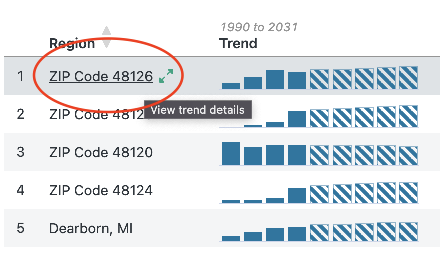
The steps to send a visualization to a report or dashboard are largely the same, regardless of where you're starting.
Step 1: Locate and click the "Save to Chart" button
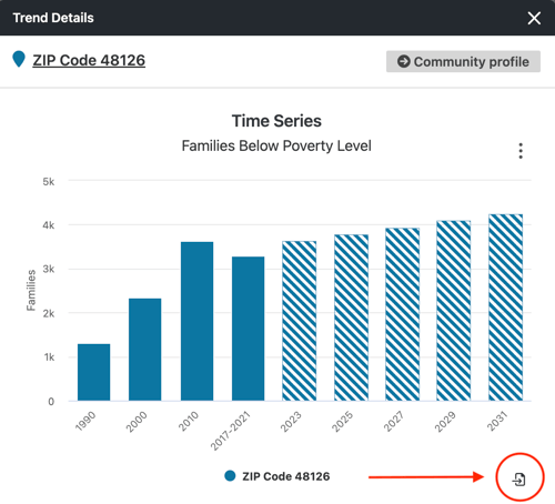
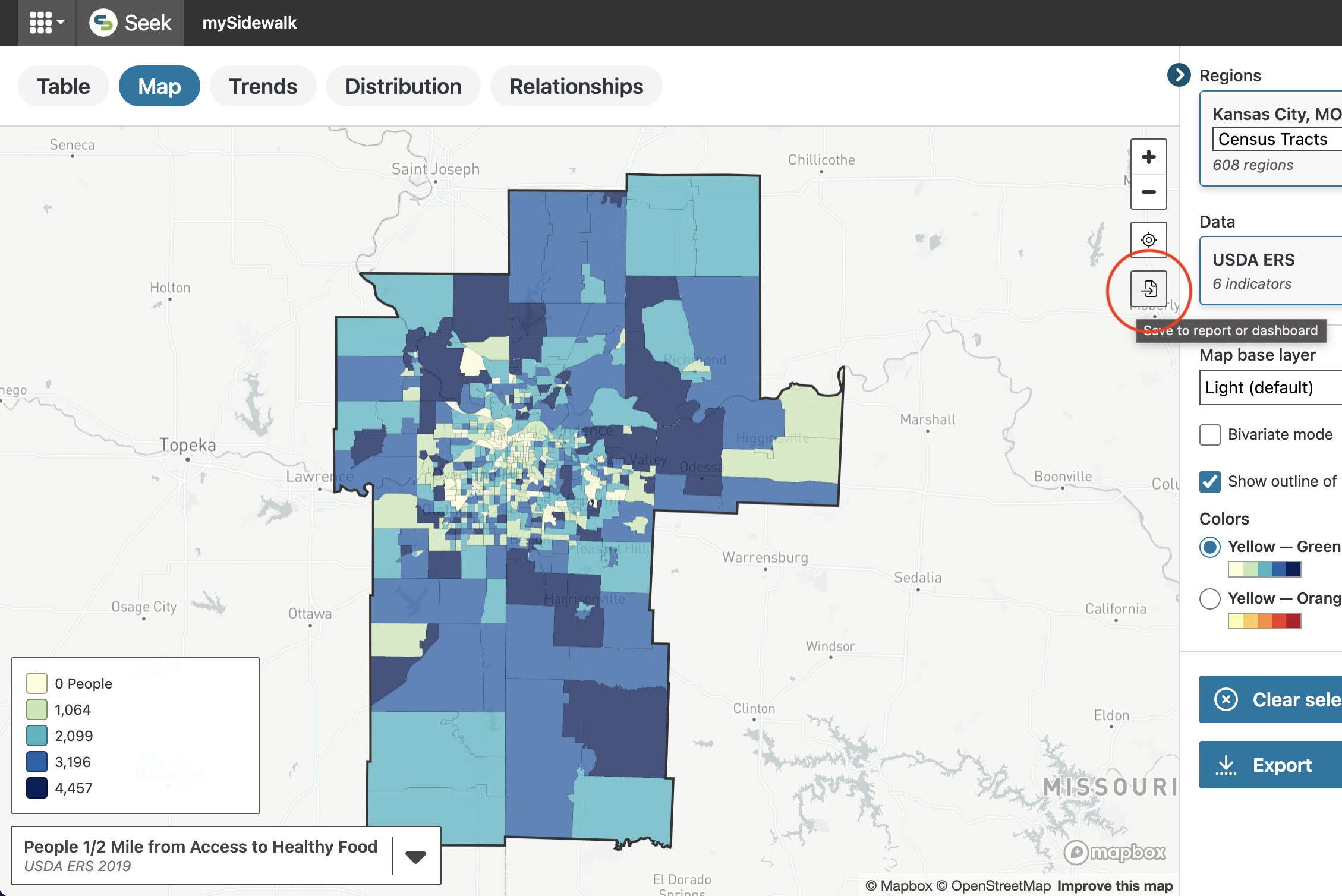
If the visualization can be saved to a report or dashboard, it will have a "send to" icon in the lower right corner of the visualization (example below). Click this icon to save the visualization in a report or dashboard.
Step 2: Select where to send the visualization
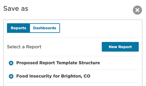
A new window will pop up asking where you want to send the visualization. You can toggle between your list of available reports and dashboards. When you've found the desired destination, click the "+" button to send the visualization to an existing report or dashboard. You can also click "New Report" to save the visualization to a new report.
Step 3: Confirm your selection
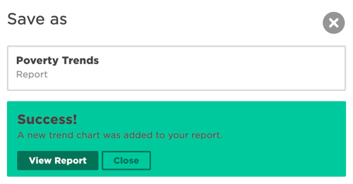
After you've made your selection, you'll be asked to confirm it. A "Success" notification will pop up to inform you that the selection is saved to your selected report. From here, you can return to Seek by clicking "Close" or you can go to your newly saved visualization for review, editing, and sharing by clicking "View Report."
Step 4: View and edit your visualization
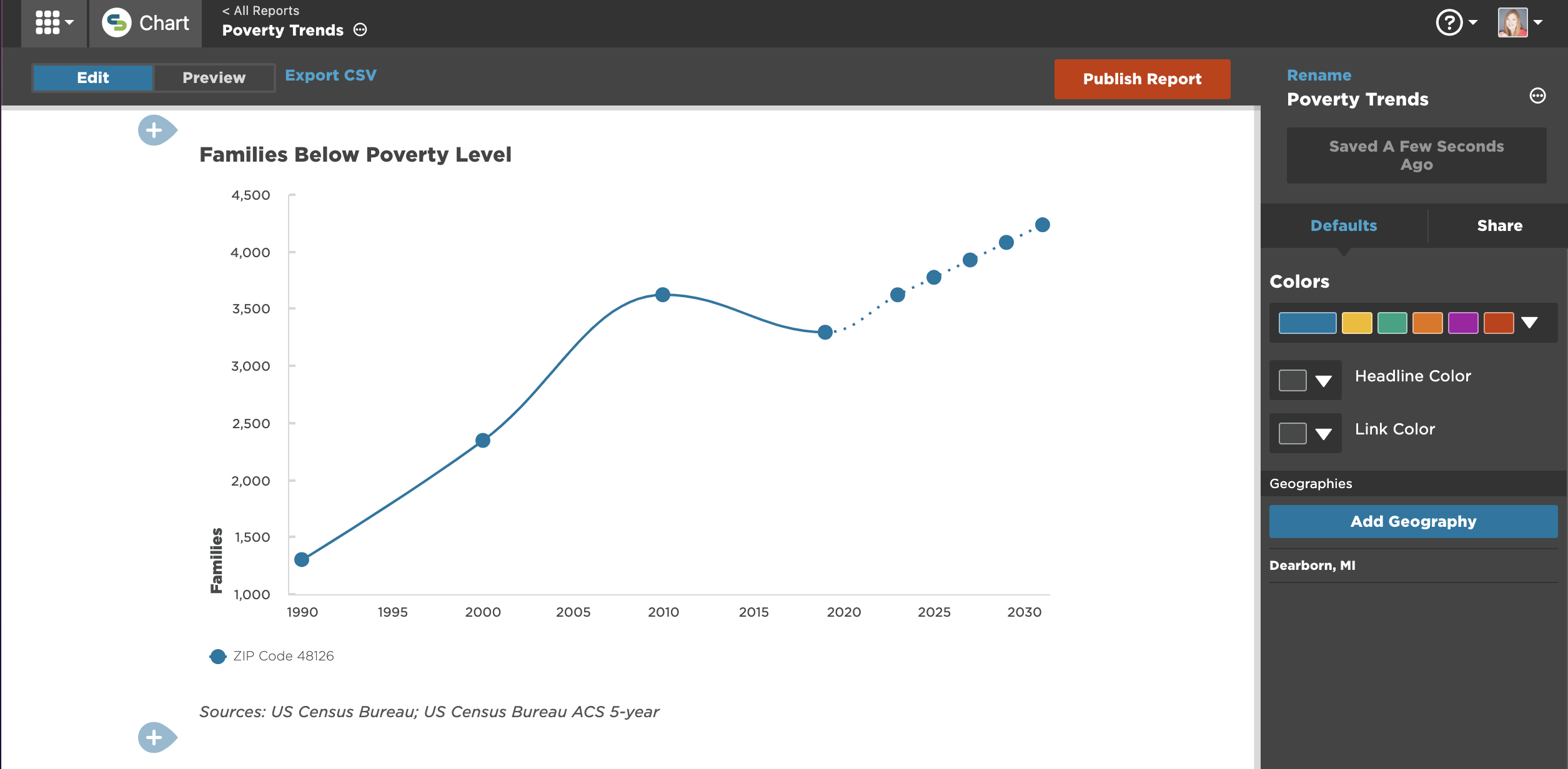
If you open the asset with the newly saved visualization, you can begin editing it as you would any visualization created in a Chart report or dashboard.
Known issues
There are a few known minor issues with the edit experience in Chart after you've saved a visualization from Seek. For example, the data in the edit experience (not the preview experience) might show as "unknown" or "null." We're working to resolve these, but if you run into anything unexpected, please drop us a note in Chat.
Options for other visualizations
The steps above work for bar charts, callouts, correlations, maps, and time series. For other types of visualizations, keep reading:
Table
For larger tables, the easiest way to represent a table from Seek in your dashboard or report is to recreate it. If there are only a small number of items or you want to showcase the outliers, a screenshot of the table is the next best option.
Ranked & distribution charts
To add a dynamic ranked or distribution chart to your document, export the chart as a PNG and upload it as an image in your document. You can use the caption to provide more details about what the chart shows.
Correlation matrix
A matrix showing correlation values can be helpful when you need to communicate the relationship between a large number of variables. Export the Relationships view as a PNG by using the "Export" button from the control panel, and then upload this image into your report.
We recommend trimming the list of indicators to only those you intend to talk about. Exporting 2-3 images, each with a smaller number of indicators, might help you communicate large selections more clearly.